STARTUP FLOW
Helping Companies Interact Better with Startups
Helping Companies Interact Better with Startups
Helping Companies Interact Better with Startups
Startup Flow is an open innovation platform for large companies to map, manage, and monitor projects with startups and innovative partners at scale.
— Partners
Startup Flow team including Grégory Guilloth (Product Manager), Delphine Barthas (Product Owner) and Quentin Lécaille (Data Analyst).
— Roles
User Research, Product Design.
— Time frame
1 month (2020)
Context
In late 2019, it was evident that the current version of the Startup Flow platform (v3) had accumulated a technical debt that was too important and impacted the user experience too heavily. A major redesign was required in order to move forward with business and product scaling.
The Product and Technical teams were therefore tasked to work on laying out the foundations of a new version (v4), codenamed 'Flamingo' 🦩.
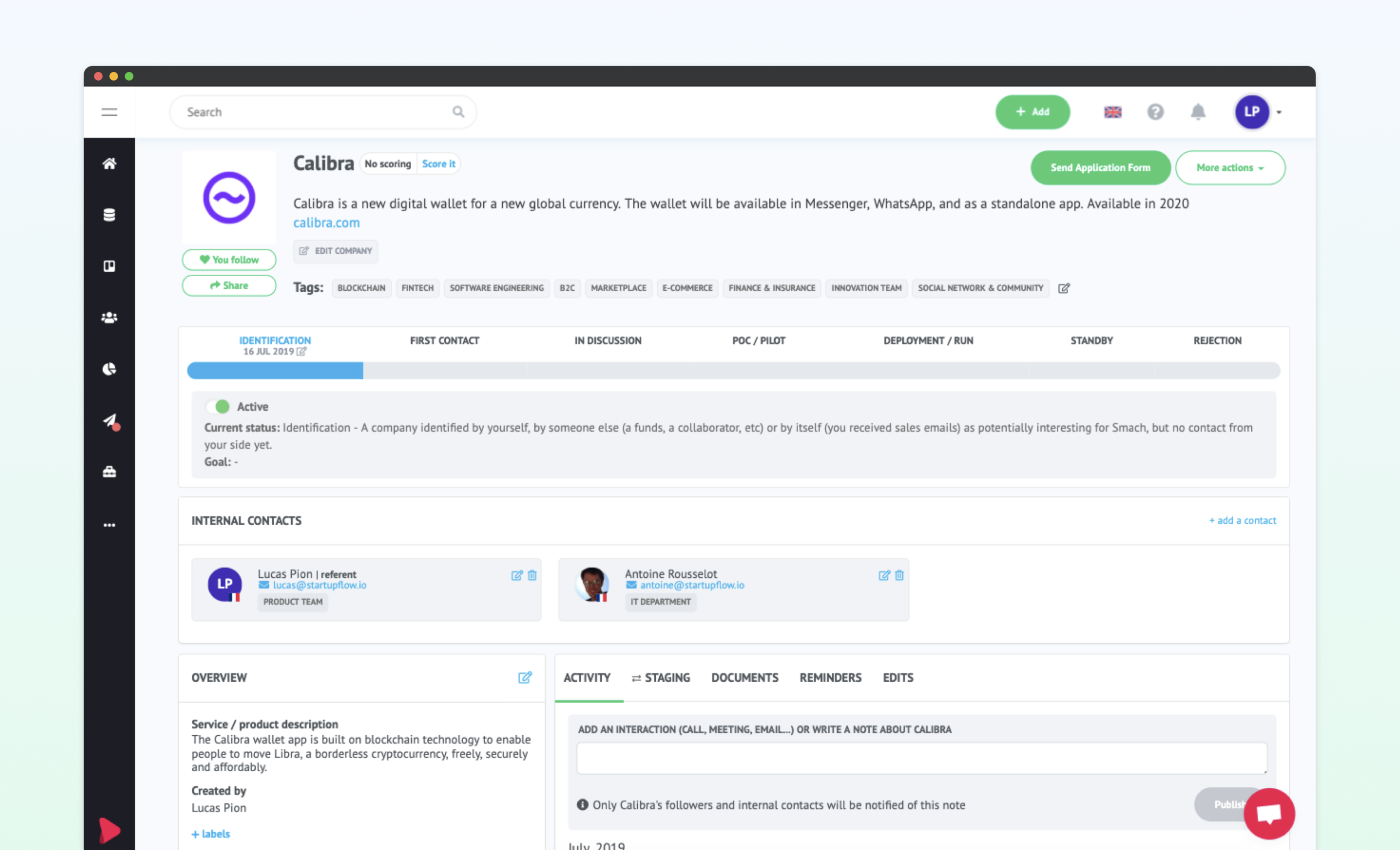
Company page example in v3.
From the start, the main goals behind this effort were to improve performance, streamline user experience as well as to refresh and harmonize the look and feel of the product. On a purely front end and design oriented sidenote, the platform had been built over the years without using a component based workflow nor clear UI/UX guidelines.
After auditing the entire platform, one of my first missions on Flamingo was to rationalize the use of components and build a design library to start working on implementation.
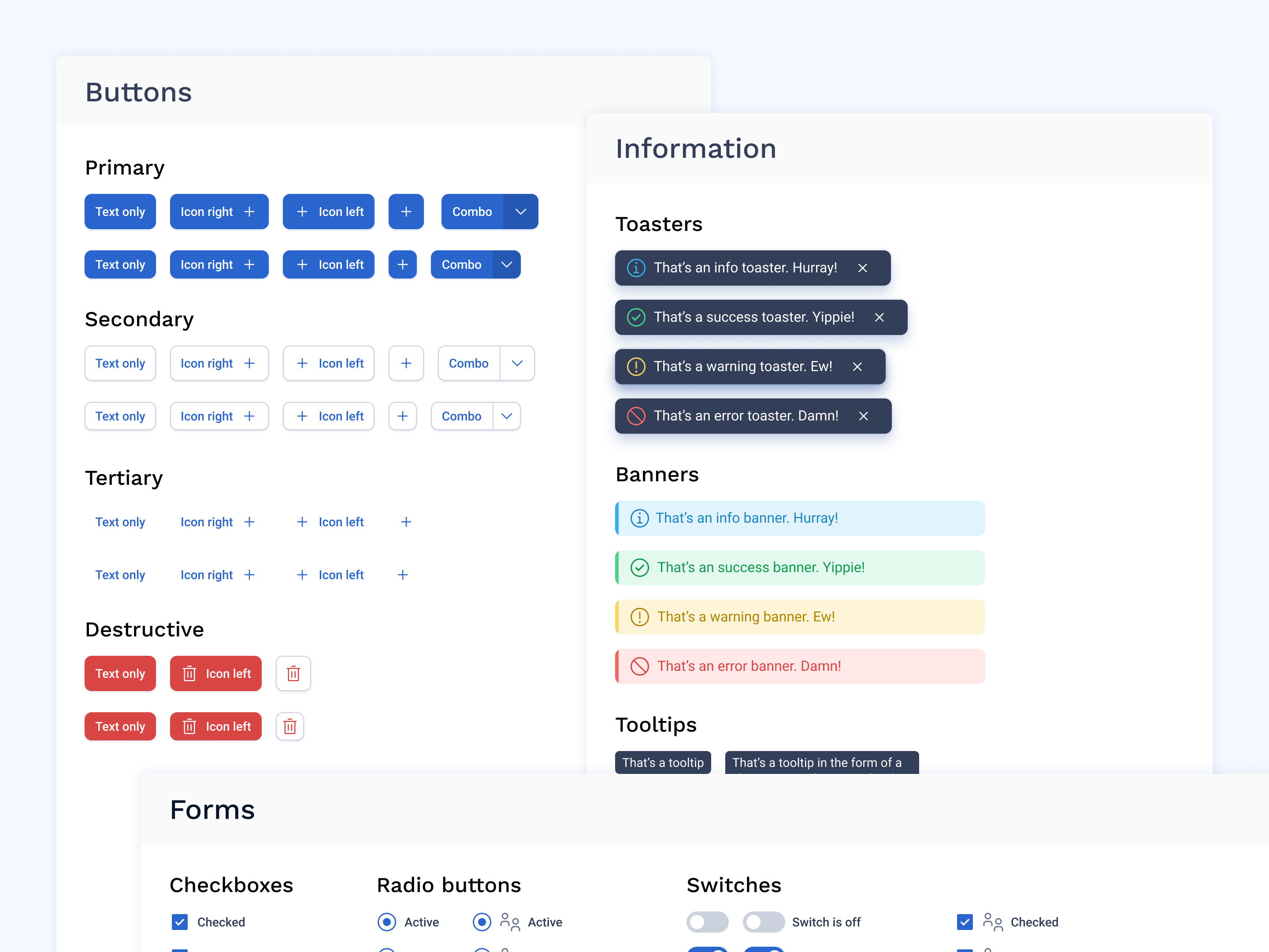
A few base components from the Flamingo library.
Outside of technical needs, this new version was also motivated by the need to evolve the value proposition of the product and its features to better suit user needs.
We had previously performed a foundation user research phase to better understand the context in which the product is used and our core user needs. This allowed us to map updated user journeys and synthesize the pain points and major needs that needed to be addressed for each module and feature of the product. This tedious study and research ultimately helped us gain a precise understanding of our clients and users expectations and served as a blueprint for the redesign.
Due to the sheer scale of the product and our limited resources, it was clear from the start that some sections of the product could not be fully reassessed and redesigned with the first release of this new version. Some trade-offs were necessary and entire sections were ported 'as-is' from v3 to v4, to be considered later on in the roadmap.
We shipped version 4 in the summer of 2020, and after a few weeks of stabilization and fixes we already had clear learnings about what worked and what needed to be improved. Both qualitative and quantitative research taught us that the core of the product (a directory for users to add startups and information about their interactions with innovative partners) still needed to be streamlined.
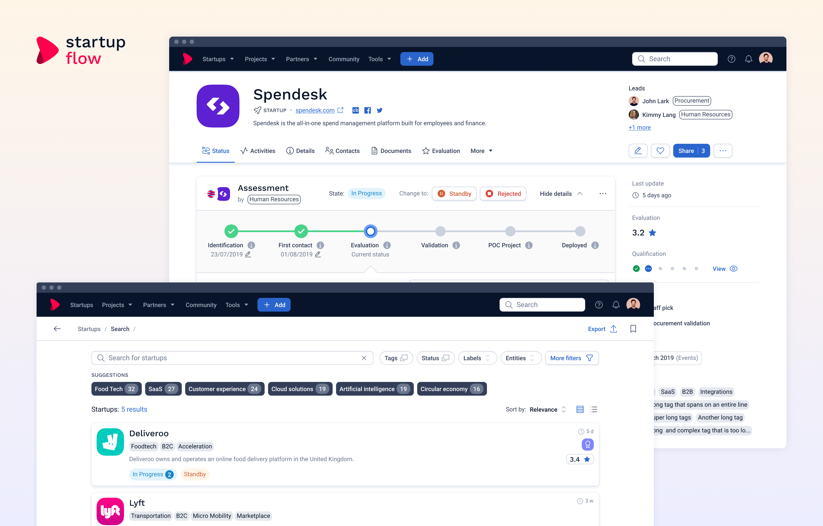
Company pages, in particular were still considered overloaded, clunky and hard to navigate. As a critical part of user journeys for both consultative and contributive users, company pages were chosen as a logical priority.
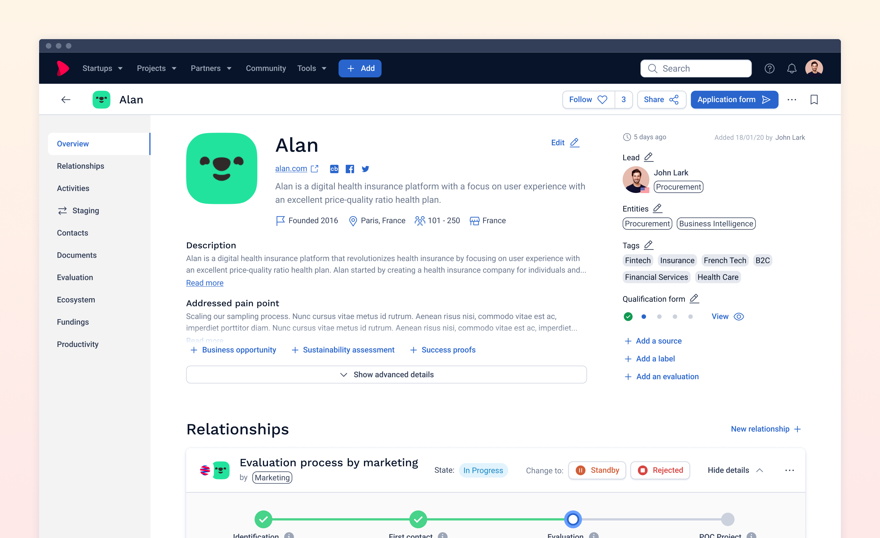
The company page in v4 before the redesign.
Challenges
Our focus points were:
 Accessibility of key actions and sections; Ease of access for content addition and edition; Clarity of navigation within the page and between the different sections; Content hierarchy, overall readability and high density of information;
Building User Knowledge
We started out the 'Discovery' phase in Harvestr, which gave us a head start since we were gathering all the feedbacks and verbatims on the subject in this tool since the start of 2020. We already had many redundant feedbacks on the topic and after a few hours of tidying up, we had a first draft of assumptions regarding ways to improve the company page.
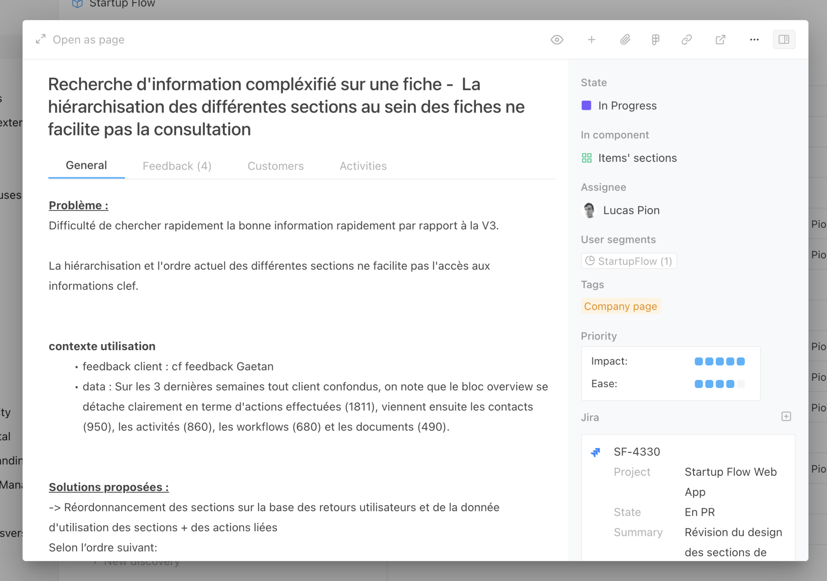
Example of a company page related discovery in Harvestr.
We collaborated closely with our Customer Success team to expand our qualitative understanding with a few additional one-ones with users and clients with specific needs.
We had started to implement actionable tracking with v4 but we were still lacking a lot of key metrics and usage data regarding navigation and key actions within company pages. We made sure to enable tracking on those KPIs for later use, and the Data team was still able to provide some key quantitative knowledge.
By combining all those sources, we had a fairly clear understanding of user journeys within the pages, the role of each section, its hierarchical importance and meaningful KPIs to track to determine the successful outcome of the project.
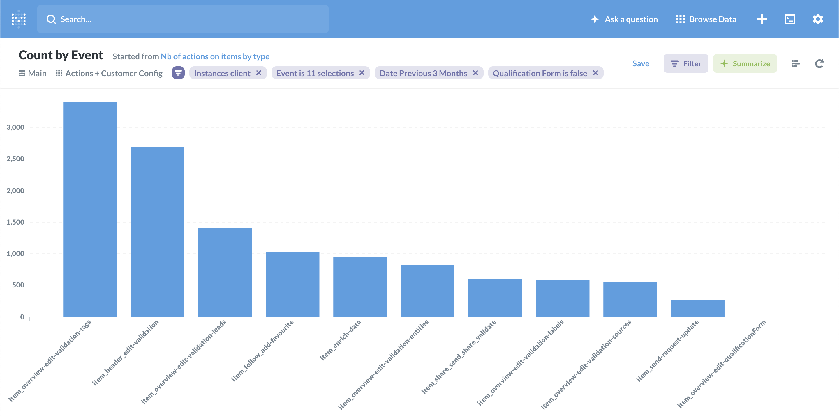
Tracking key actions using Metabase.
We refined our previous assumptions enriched them with user feedbacks, and turned them into clear, actionable ways of improvement to be explored in design for the next step. This took the form of user stories.
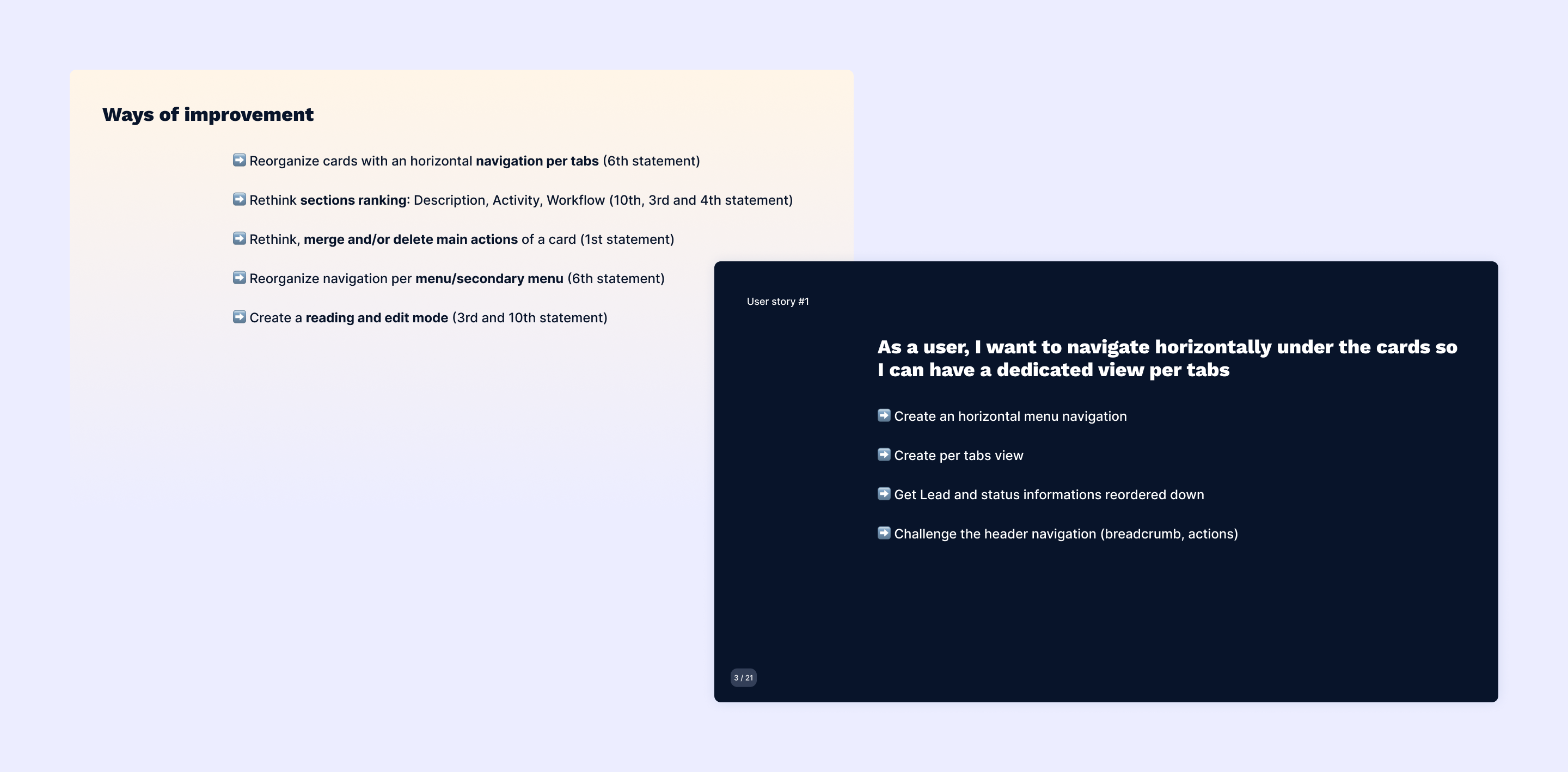
Ways of improvement and user stories.
Iterating on solutions
With functional user stories clearly defined, I started a benchmark looking for solutions in similar or analog digital products with common challenges.
This benchmark included:
Pipeline powered products (Hubspot, Pipedrive, Salesforce, Microsoft Dynamics, Zoho...); Productivity tools (Clickup, Asana...); Directories (Crunchbase, Index.co, Producthunt...); Social Networks (Github, Facebook, Linkedin...);
The outcome was a list of best practices and visual references.
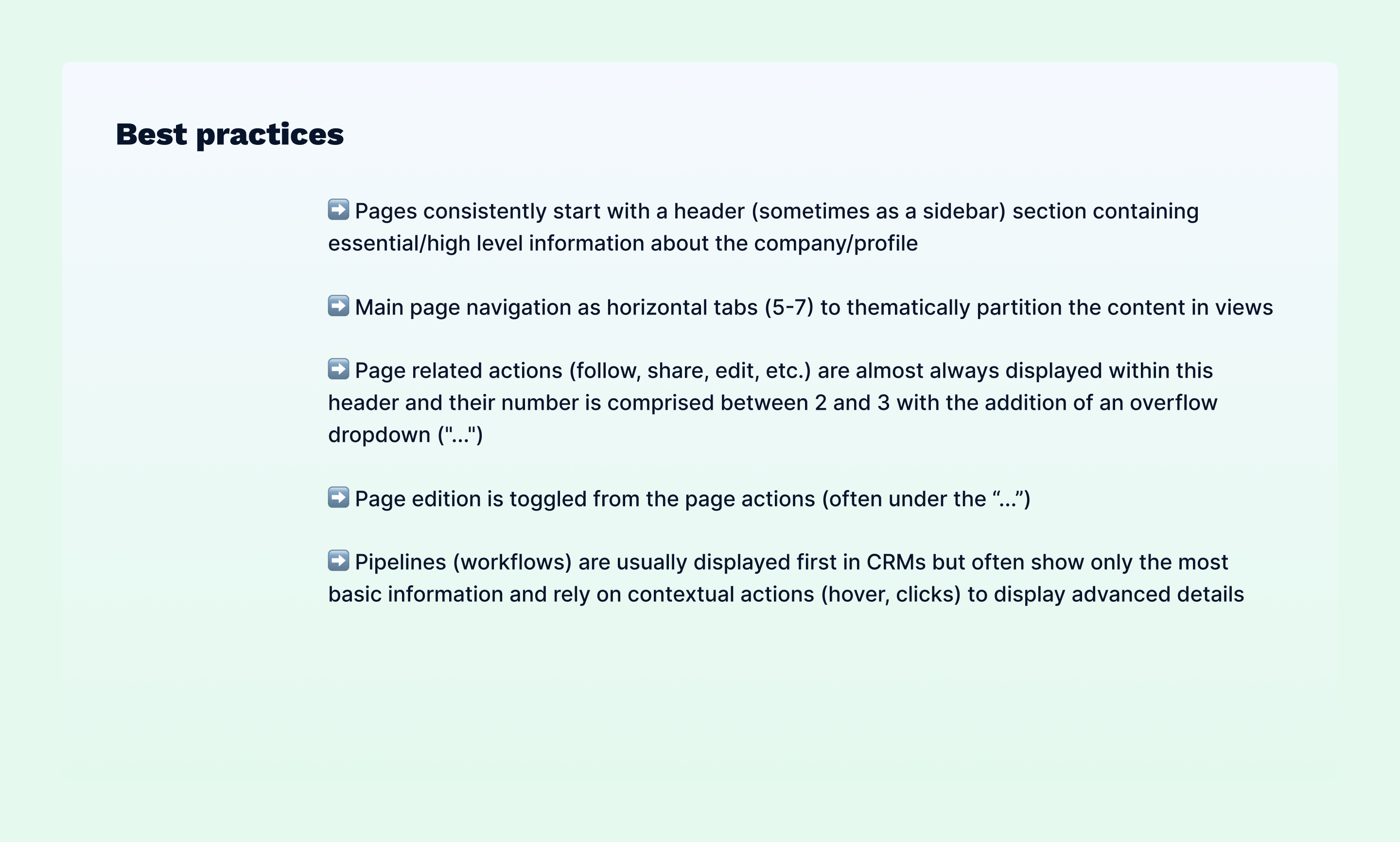
Best practices from the benchmark session.
I started design exploration with a few low-fidelity wireframes and grey scale mockups. Some quick internal design critiques and feedbacks sessions helped me narrow the proposition to two slightly different alternatives for page structure and navigation.
The next step was an in depth consultation with the Technical team to assess technical constraints and feasability, as well as gather their expert feebacks on product components.
We needed to quickly confront those mockups to real users, assess the choices made and iterate accordingly.
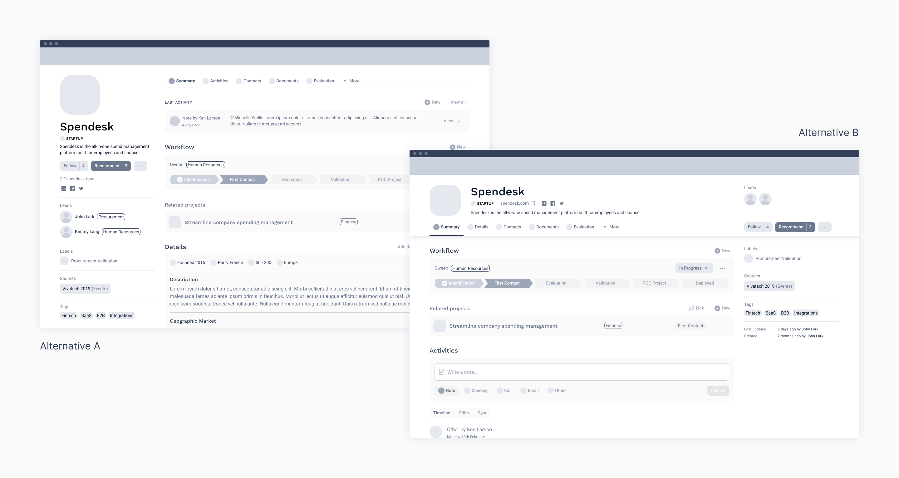
Low-fidelity mockups of both alternatives.
We synchronized with the Customer Success team to setup testing sessions with various user types and clients. We defined a narrative with key tasks to perform in order to evaluate user response to both alternatives, and I built an extensive interactive prototype in Figma for the sessions. We purposefully chose to stay at low-fidelity for this exercise in order to focus on the global page architecture and navigation.
Low-fidelity interactive prototype built for user testing sessions.
After running 10 sessions within a week, we had a clear overview of the next steps. Feebacks were unanimously positive, and every user stated that it was a massive improvement to the current version. We gathered valuable acknowledgements, wording improvements and insights.
We asked users to rate both alternatives from 0 to 5. Version B was prefered by 8 out of 10 participants and had a better average mark (+0.4 at 3.9). We reasonably agreed on pursuing with version B while iterating on the few improvements that we had identified.
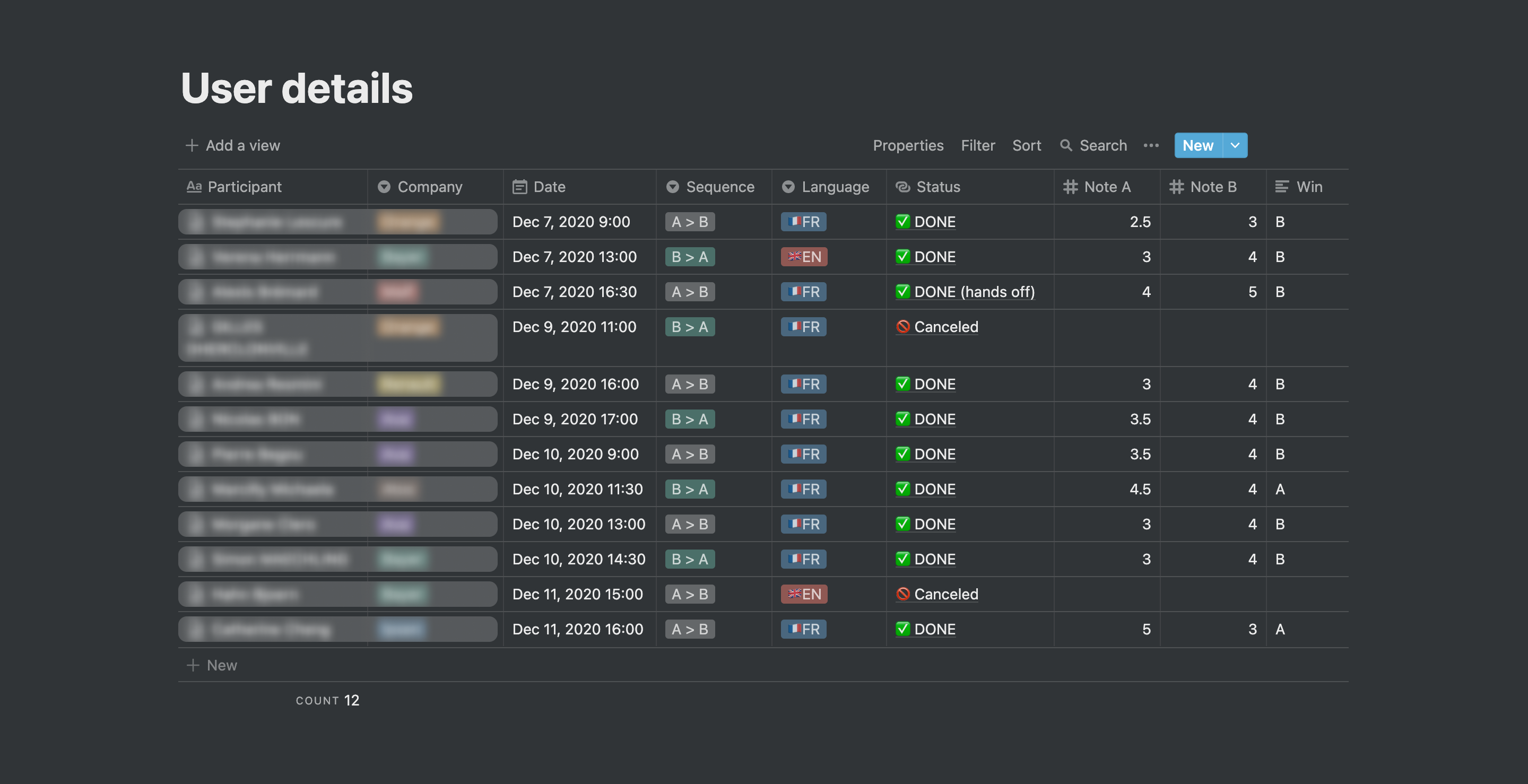
Summary of the user tests performed during the week.
From there I refined and updated the mockups and performed a few internal feedback sessions to progress fast. We were sufficiently satisfied with the result to convert the proposition into high fidelity mockups and confront it one last time in an open internal design critique.
The final steps of the design process involved completing the designs and flows, producing specs and documentation, and working closely with developers to implement the solution smoothly into production.
Takeaways
The company page redesign is being successfully released in production. Conclusive key metrics and quantitative feedback start pouring in, and will help us assess decisions made on a larger scale to confirm if the objectives are fully reached.
The complexity and scope size of the company page makes it impossible to tackle in a single project, but for its structure, clarity and navigation, it marks a massive improvement in the user experience of this critical part of the product.
On a personal level, this specific project was a great illustration of a product design process done well and efficiently. After a few month of longer development cycles for v4, it was refreshing to fall back on a smaller project and execute it well within 4 weeks.